

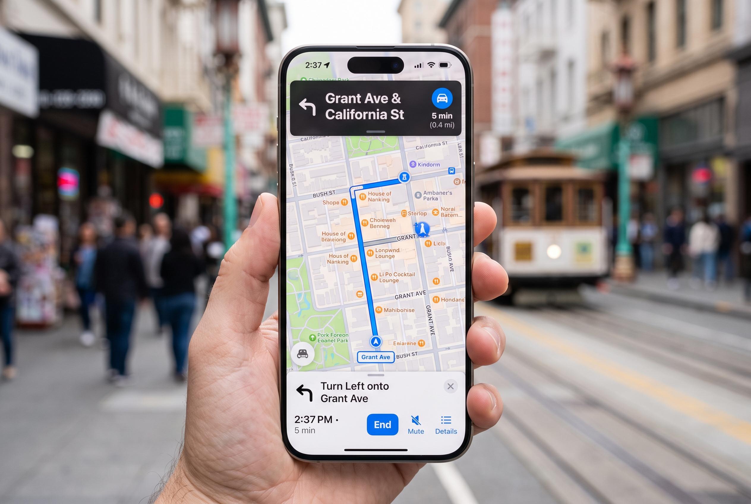

Apple Maps offers a simpler, more user-friendly experience with refined controls and deeper integration within the Apple ecosystem, despite regional coverage gaps and fewer transit features compared to Google Maps.
Apple Maps can be easy to use and surprisingly deep once you know what the buttons do. According to TechPP’s guide, the app’s main screens are built around a small set of recurring symbols for search, directions, location tracking, saved places, offline maps, reporting problems and sharing arrival times, all of which are intended to keep the interface relatively clean.
That simplicity has long been part of Apple Maps’ appeal, even if it still trails Google Maps in some areas. The guide notes that the service has improved over time and is especially well integrated with the wider Apple ecosystem, but it also acknowledges weaker coverage in some regions, fewer transit features and less comprehensive real-time data than its biggest rival. For many iPhone users, though, it remains the default mapping app and a practical first choice.
The home screen is where most of the core controls live. TechPP says the map-type button switches between views such as driving, public transport, satellite and explore modes, while the recenter control returns the map to your current position during navigation. The profile button opens saved places, reports and offline maps, while search and voice input handle destination look-ups. Other familiar symbols include the compass, which points north when the map is rotated, plus the weather and air-quality display and the current-location marker.
From the profile area, users can reach saved places, guides, location sharing, location bookmarking and issue reporting. The article says Apple Maps also uses this hub to surface Home and Work entries, favourites, downloaded offline maps and preference settings, including route choices such as avoiding toll roads, hills or busy roads. That makes the profile menu the app’s main control centre rather than just an account page.
The place-details screen adds another layer. According to the guide, it offers buttons for sharing a location, downloading it for offline use, getting directions, saving it to a library or marking it as a favourite. The three-dot menu expands those options further, allowing users to add notes, pin a place, share it again or report incorrect details such as a wrong address, category or opening hours.
Apple Maps’ navigation screens are built around a smaller set of travel tools. TechPP says users can switch between driving, walking, transit, ride-hailing and cycling directions, add and reorder stops, and use voice input to insert destinations hands-free. During a route, the app can show trip distance, arrival time and step-by-step instructions, while the swipe-up panel exposes controls for sharing estimated arrival time, reporting incidents and ending the journey. The guide also covers the offline maps area, where users can download specific regions and manage them later, along with sections for pinned places, recent additions, reports and route preferences.
Taken together, the article argues that Apple Maps has deliberately kept its visual language straightforward. That design choice may not match every power user’s needs, but it does make the app less intimidating for newcomers, especially those moving over from Google Maps. The result is a service that is still evolving but already easy to navigate once the icons start to make sense.
Disclaimer: This content is intended for informational purposes only. Readers are advised to exercise their own judgement, conduct due diligence, or consult a qualified expert before acting on any information provided.