

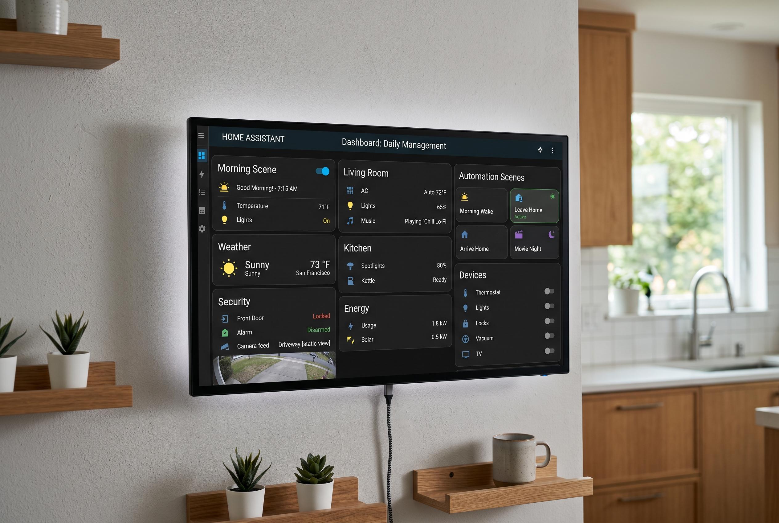

A newly rebuilt Home Assistant dashboard transforms home control on a dedicated wall display by prioritising a clean, organised layout with dynamic visuals and context-aware automations, showcasing an advanced, customisable interface for daily household management.
A Home Assistant dashboard can be functional without being especially pleasant to look at. In this rebuild, the aim is different: a full-screen wall display that feels like a finished product rather than a collection of cards dropped into a default layout. The design is built around the Shelly Wall Display X2i and uses custom cards, CSS and templating to create a cleaner control surface for scenes, energy data and vehicle status. Integration guides for the Shelly display and Home Assistant’s own grid system both point to the same principle: once a dashboard is meant for a fixed screen, layout discipline matters as much as functionality.
At the core of the build are several HACS components, especially button-card, layout-card, card-mod, stack-in-card and the Price Timeline Card. Home Assistant’s card model is deliberately flexible, and third-party guides on dashboard cards and HACS customisation explain why that matters: built-in cards are useful, but custom cards give far more control over appearance and behaviour. In this project, most elements that look like tiles are actually button-cards with JavaScript templating, which lets icons, colours and labels change according to entity state.
The layout itself is based on a measured grid rather than the usual masonry arrangement. Home Assistant’s grid card documentation highlights the value of organised card placement, but this build goes further by fixing exact column widths and row heights to match the usable browser canvas on the display. That avoids the shifting, uneven feel of a phone-first interface and gives the wall screen a stable visual structure. The left edge is used for navigation, while the main panel holds a large living-room image and a set of square control tiles.
The display also uses panel mode and kiosk mode so the dashboard can occupy the full screen without the usual Home Assistant chrome. That approach is common in dedicated wall-panel builds, and Shelly-focused setup guides recommend restricted users and kiosk-style presentation for precisely this reason. On this system, the interface stays minimal for the wall display user while remaining more conventional when opened elsewhere.
One of the more distinctive elements is the main image panel, which swaps between different room renders depending on the state of the lights and the time of day. Rather than using a plain backdrop, the dashboard presents the space as a visual scene, then changes it with templating and card-mod styling. That gives the interface a more product-like feel, while still reflecting the actual state of the home. A separate “cozy” mode adds another visual variant when a relaxed scene is active.
To make scene control visible, the build uses a simple scene-tracker pattern. Home Assistant scenes do not keep an active state in the way switches do, so the dashboard pairs each scene with an input_boolean. That extra state makes it possible to show which mode is active, switch button styling accordingly and let automations check the current room mode before acting. It is a practical workaround for a limitation that many Home Assistant users eventually run into when they begin building more advanced interfaces.
Lighting automation is driven by real illuminance readings rather than sunset alone. That matters because ambient light indoors can change long before astronomical dusk, especially on dull or rainy days. The automation logic uses thresholds and time windows so lights respond to sustained changes in brightness, not brief fluctuations. A “for” condition prevents rapid cycling when clouds pass overhead, which is a common problem in sensor-based lighting control. For outdoor lighting, the build relies on sun elevation, which is a more stable seasonal reference than fixed clock times.
The same dashboard also coordinates more complex household modes, including cooking. If a brightness-based automation fires while cooking mode is active, it does not simply overwrite the higher kitchen setting. Instead, it calls a variant scene that preserves the cooking brightness while restoring the rest of the house to its normal levels. That sort of context-aware scene handling is one of the clearest signs that the system was designed for daily use rather than demo value alone.
Beyond lighting, the project extends into irrigation and mower control. The garden watering logic uses a rolling water budget built around evapotranspiration, a standard measure of how much moisture plants and soil lose over time. Rain forecast and historical data are combined with local weather-station readings where available, and the mower routine uses the same data to delay cutting after rainfall until the lawn should have dried. That is a more predictive approach than relying solely on a mower’s own rain sensor.
The repository is structured so other users can adapt it. Entity IDs are replaced with placeholders, and the README maps those values across dashboards, scenes and automations. That makes the project easier to fork, although the irrigation and mower features still need location-specific data and integration details. It is also useful that the author has separated the wall display, garage view and mobile dashboard, because Home Assistant dashboards tend to work best when each screen is designed for a specific job rather than trying to do everything at once.
Disclaimer: This content is intended for informational purposes only. Readers are advised to exercise their own judgement, conduct due diligence, or consult a qualified expert before acting on any information provided.