

Roku’s latest home screen update prioritising personalised recommendations has left many users seeking ways to restore a simpler, more app-focused interface, prompting tips on customisation and layout adjustments.
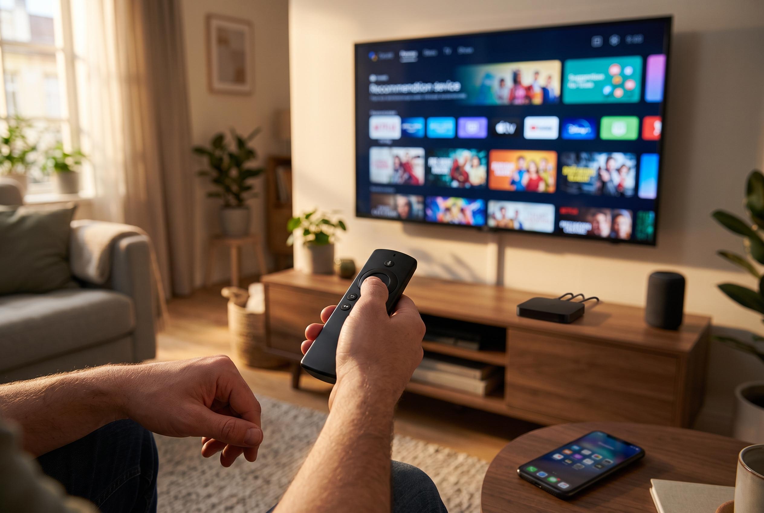
Roku users who preferred a simple launcher may now find the platform harder to navigate. In May 2026, the company redesigned its Home screen to foreground personalised recommendations and other discovery features, a move Roku says is intended to help users find favourite apps, shows and films more easily. For households that mainly use Roku as a straightforward app hub, the new layout can feel less efficient, with the core apps pushed lower down the page.
One of the most effective ways to restore a cleaner layout is to hide the recommendation rows. On affected devices, that removes the large content strip that occupies valuable space near the top of the Home screen and moves the app grid back into a more prominent position. Roku’s own support pages describe the updated Home screen as customisable, including the ability to alter how recommendations are displayed. PCWorld has also pointed out that this setting is the key way to remove the “Top Picks for You” style rows from view.
It is harder to do much about the prominent advert panel on the right side of the interface, because Roku does not offer a simple way to remove it entirely. Even so, users can reduce how invasive that advertising feels. Roku’s support site says the Star button opens options for changing an advert or adjusting sensitive-ad preferences, and the same controls are available through the Privacy and Advertising menus in Settings. Turning off sponsored wallpapers is another useful step. That does not eliminate advertising, but it does remove one more layer of promotional content from the Home screen background.
The interface can be stripped back further by hiding shortcuts and other menu items that are rarely used. Roku includes a Home screen settings area where users can switch off Quick Access and, depending on the model and software version, other extra rows or links. These elements are not necessarily intrusive on their own, but together they contribute to a busier screen and require more scrolling before the main app grid appears. Removing them makes the system feel more direct, especially on devices that are used daily.
A final but practical improvement is to standardise app order across every Roku device in the home. Roku lets users move apps manually from the Home screen, and placing the most-used services in the same positions on each television or streaming stick reduces friction for everyone in the household. The result is not a fully ad-free experience, and it does require repeating the changes on each device separately. But for users who want Roku to behave more like a clean app launcher than a recommendation feed, these adjustments make a noticeable difference.
Disclaimer: This content is intended for informational purposes only. Readers are advised to exercise their own judgement, conduct due diligence, or consult a qualified expert before acting on any information provided.