

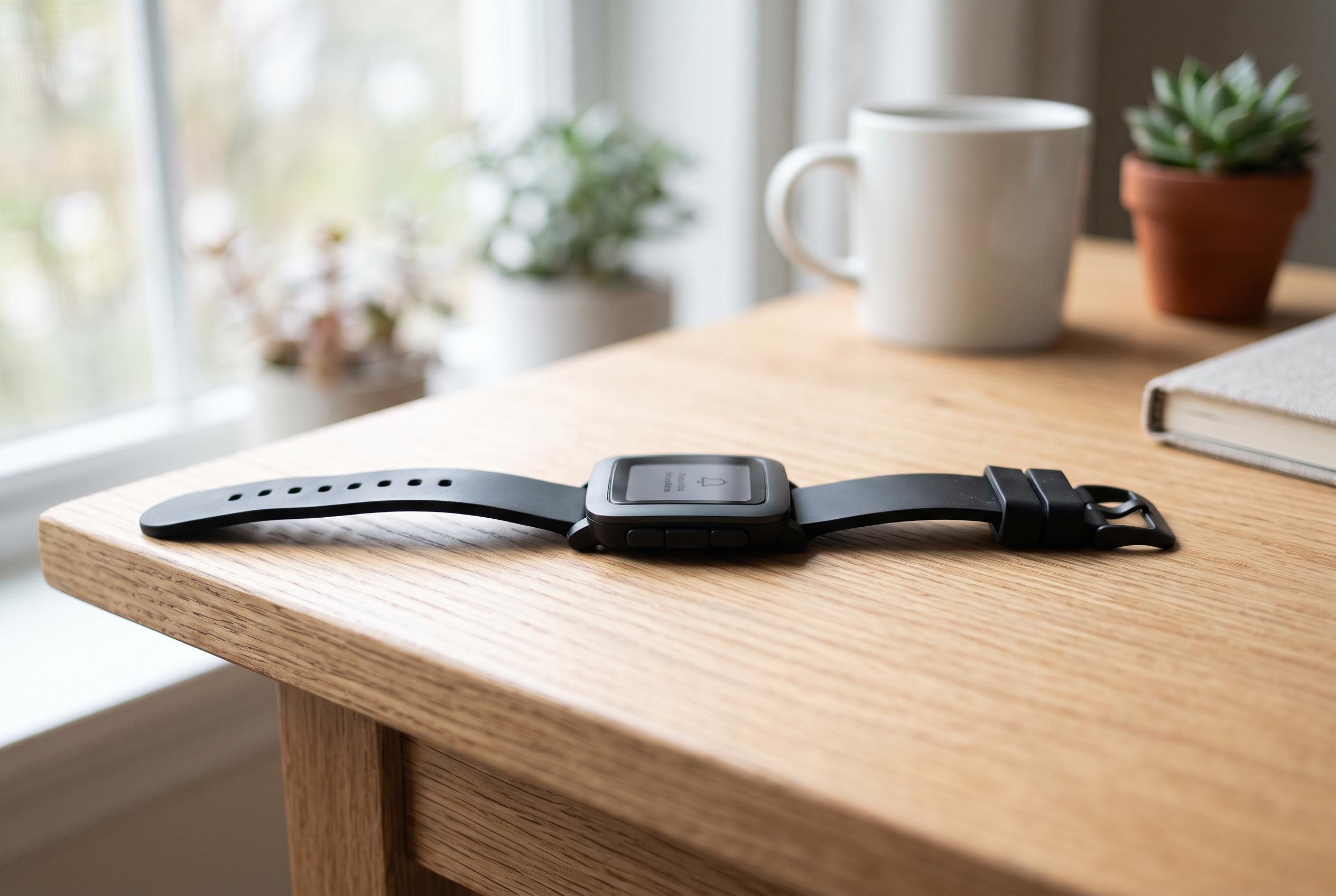

The Pebble Time 2 returns with a deliberately pared-back design aimed at reducing smartwatch fatigue, emphasising core functions and remarkable battery life amidst a market of feature-rich rivals.
Pebble Time 2 arrives as a deliberate answer to smartwatch fatigue. In Gizmodo’s hands-on review, the revived Pebble brand is presented not as a rival to Apple Watch or Galaxy Watch at every turn, but as a narrower, more personal alternative: a watch built to show notifications, track basics and stay out of the way. That restraint is central to its appeal, as is the sense that it was made by people who want this exact sort of device on their own wrists.
The hardware reflects that philosophy. MacRumors said the Pebble Time 2 uses a 1.5-inch rectangular face, a 64-colour e-paper touch display, a stainless-steel case and physical buttons on the side. TechCrunch reported that Core Devices, led by Pebble founder Eric Migicovsky, has framed the watch as a return to the original idea of Pebble: a retro, hacker-friendly smartwatch with long battery life and physical controls rather than a feature-heavy wellness platform. The device is priced at $225 and is expected to ship in December, according to MacRumors.
That positioning also helps explain what the Pebble does not try to do. The Gizmodo review argues that it is not meant to compete with today’s premium health-centric wearables, which increasingly bundle temperature sensing, richer activity coaching and AI-generated summaries. Instead, it keeps to the essentials: notifications, timekeeping, simple fitness metrics and a modest set of extras such as media controls and weather. In that sense, the watch seems aimed at users who have no interest in being constantly nudged by their wrist.
Battery life is one of the strongest parts of the argument. The review describes endurance of up to two weeks in real-world use, with MacRumors citing an estimated 30 days, depending on configuration and usage. Stuff similarly noted that the watch offers an always-on display without nightly charging. That kind of longevity remains rare in a market dominated by bright OLED screens and more demanding software stacks.
The display is also the model’s most obvious compromise. Gizmodo found the screen difficult to read in strong outdoor light, especially in its standard brightness mode, while also noting the limited colour range of the 64-colour e-paper panel. That gives the watch a distinct personality, but it also places hard limits on contrast, animation and app compatibility. Existing app support is still thin, and the watch appears to work best when used for its core functions rather than for experiments with third-party software.
Even so, the Pebble Time 2 seems to succeed on feel as much as features. Gizmodo praised the tactile satisfaction of the buttons, the playful interface animations and the sense that the watch is less a productivity engine than a small, cheerful object with a clear point of view. Wareable’s earlier coverage of Pebble devices noted that the brand has long paired useful basics such as heart rate, step and sleep tracking with a design language that will not suit everyone. That remains true here. The difference is that Pebble appears to have embraced that narrower audience rather than apologising for it.
Disclaimer: This content is intended for informational purposes only. Readers are advised to exercise their own judgement, conduct due diligence, or consult a qualified expert before acting on any information provided.