

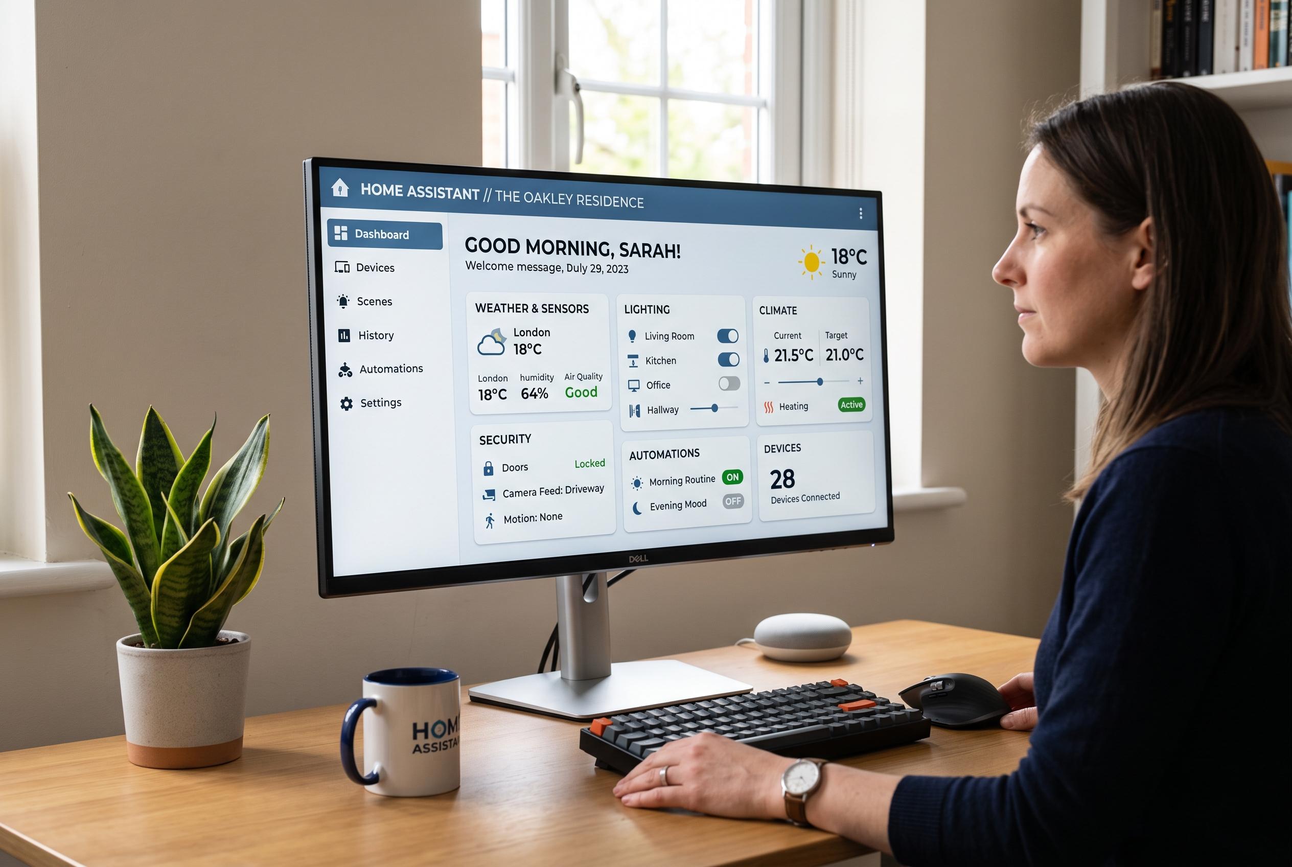

A shift from live editing to pre-planned mock-ups using Figma enhances dashboard clarity, organisation, and user focus in Home Assistant, especially for complex setups in 2024.
Home Assistant can be remarkably flexible, but that flexibility often creates a familiar problem: the more devices and entities a user exposes, the easier it becomes to build a dashboard that is functional but visually unsettled. One XDA Developers writer described solving that by moving the planning stage into Figma first, using the design tool to decide what deserved space before returning to Home Assistant. That approach turned a process of constant rearranging into one of deliberate selection.
The core benefit was not cosmetic. According to Home Assistant’s own dashboard documentation, the platform is built for custom dashboards with different card types, themes and custom components, while its 2024 dashboard update added a more structured sections view, a grid system and drag-and-drop editing. Even with those tools, the XDA account suggests that deciding priorities outside the live interface made it easier to separate useful information from items that were merely available to display.
That shift in process also changed what belonged on screen. Figma made it harder to fall into the habit of treating every discovered sensor, switch or integration as equally important. The writer said the design stage forced a simpler question: whether a piece of data actually needed to be visible every time the dashboard opened. That is consistent with Home Assistant guidance and third-party dashboard advice that stress organising views around rooms, tasks and usability rather than exposing every entity at once.
Hierarchy was the next issue. Once the number of cards was reduced, the problem became deciding what should dominate the layout and what could remain secondary. The writer found that working in Figma made it easier to move whole sections, compare spacing and group controls by purpose rather than by the hardware producing the data. Figma’s own template library reflects the same logic, offering reusable dashboard components for charts, widgets and varied layouts that can be adapted to different use cases.
The exercise also exposed flaws that are easy to miss when editing one card at a time inside Home Assistant. A component may look fine in isolation but feel out of place once neighbouring elements are added. The broader view made repeated information, awkward spacing and inconsistent emphasis easier to spot before any time was spent implementing them in the live dashboard. Home Assistant’s 2024 dashboard changes were meant to make layout management more intuitive, but the article argues that pre-planning still gives users a clearer benchmark for what the finished interface should accomplish.
The writer eventually went beyond mock-up work and turned the Figma design into a functional interface connected to Home Assistant entities. That required extra effort, including building the web app and resolving presentation issues when the rendered result did not initially match the design. It also highlighted a practical trade-off: Home Assistant’s native editor is quicker for simple setups, but a Figma-first workflow can support more disciplined design for complex dashboards, especially when the goal is to reduce clutter and make important controls easier to reach.
The broader lesson is that the value of a dashboard is not measured by how much it can show. It is measured by how well it answers the questions a user actually asks. For that writer, Figma became a planning layer that reduced rework, improved structure and made the final Home Assistant view feel more intentional. Home Assistant still supplies the controls, but the design step now determines what earns a place on the screen.
Disclaimer: This content is intended for informational purposes only. Readers are advised to exercise their own judgement, conduct due diligence, or consult a qualified expert before acting on any information provided.