

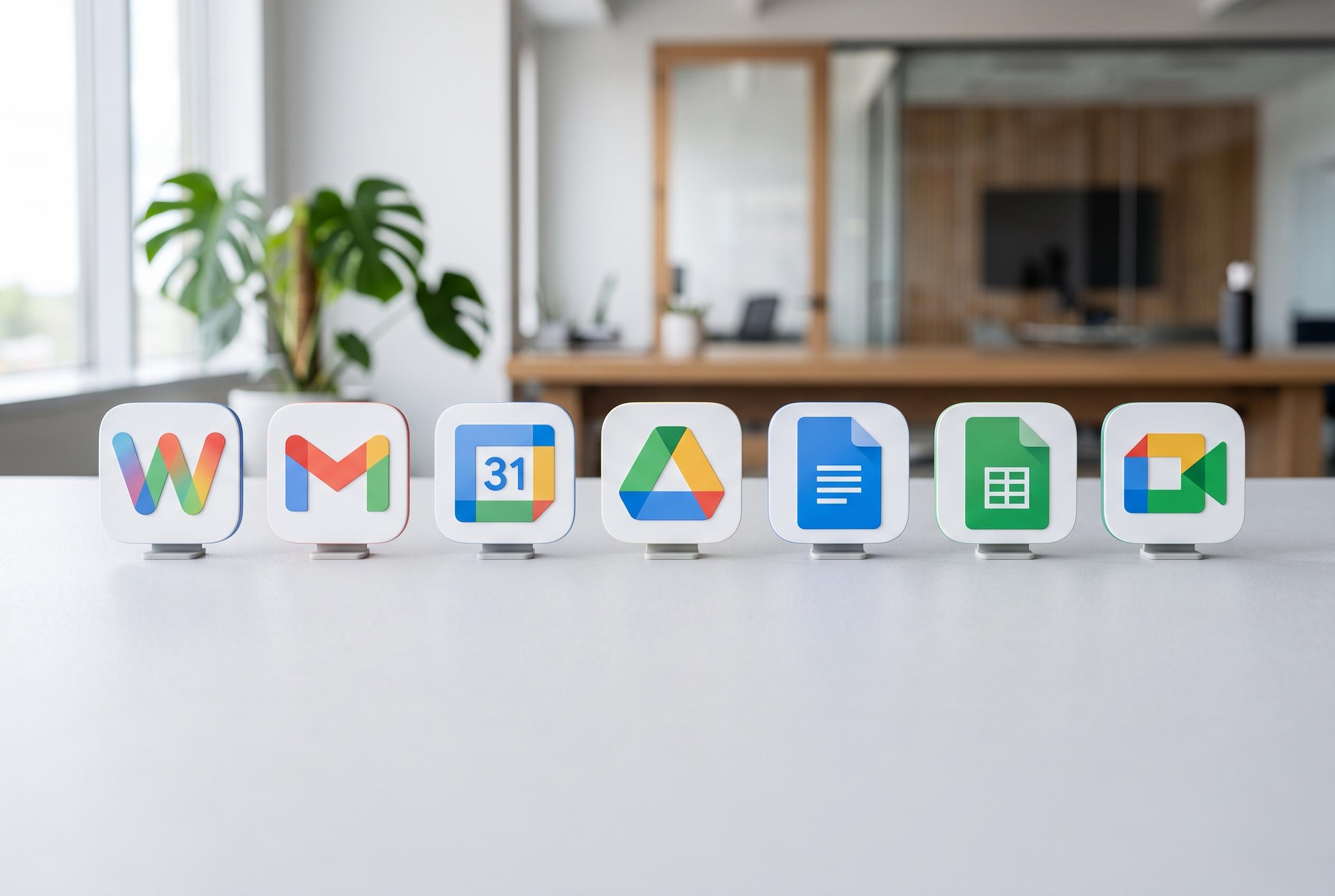

Google completes a significant redesign of its Workspace app icons, introducing gradient styles that improve clarity and visual identity, aligning with its AI-focused branding ahead of Google I/O 2026.
Google is finishing a broad redesign of its Workspace app icons, replacing the flat four-colour set introduced in 2020 with softer gradient versions that are meant to look more distinct on screen. The change now spans Gmail, Calendar, Chat, Meet, Drive, Docs, Sheets, Slides, Keep, Forms, Voice, Sites, Tasks and Vids, and Google says it is intended to give each app a clearer identity while keeping the suite visually consistent.
The update matters because Google’s previous icon system had become increasingly difficult to read at a glance, especially on phones, browser tabs and app launchers. According to reporting from 9to5Google and TechRepublic, the old design relied on a rigid page-like container and a near-uniform use of blue, red, yellow and green, which made many Workspace apps look too similar. The new approach uses one dominant hue for most products, with Drive remaining the main exception.
Gmail has changed conservatively. The envelope shape remains, but the colours now blend more smoothly and the icon carries a stronger red emphasis. Calendar has moved further away from its earlier look, dropping the old multi-colour frame in favour of a simpler blue-led design that gives it a clearer presence beside Google’s other apps.
Other Workspace apps have been simplified in different ways. Docs, Sheets, Slides, Keep, Forms, Sites and Vids no longer sit inside the same page-style container, which makes their symbols easier to tell apart. Meet and Chat have also shifted towards a more gradient-led style, while Drive now uses a three-colour treatment rather than the full four-colour formula.
The rollout was staggered. 9to5Google reported that the new icons began appearing on May 18, 2026, first in Google’s app launcher and on Chrome’s New Tab page, before reaching the apps themselves. Google then confirmed the redesign in late May as a “fresh visual identity”, saying the changes would spread across Rapid Release and Scheduled Release accounts over time. Android users saw the final stages of the rollout in early June, with Gmail the last major holdout.
The timing also fits Google’s wider product strategy. The icon refresh arrived just ahead of Google I/O 2026, where the company pushed Gemini-powered features across Workspace and framed the new look as part of its “Gemini Era”. That makes the redesign more than a cosmetic update. It also serves as a visual marker linking Gmail, Docs and the rest of Workspace to Google’s AI-focused branding across Search, Photos, Maps, Home and Gemini itself.
For users, there is nothing to configure and no way to opt out. Google said the redesign does not change core functionality or administrative controls, and the new icons are applied automatically as each account reaches the rollout. For now, the main practical effect is simply clearer branding: a more recognisable Calendar, a more prominent Gmail and a suite that looks less like a set of near-identical tiles.
Disclaimer: This content is intended for informational purposes only. Readers are advised to exercise their own judgement, conduct due diligence, or consult a qualified expert before acting on any information provided.