

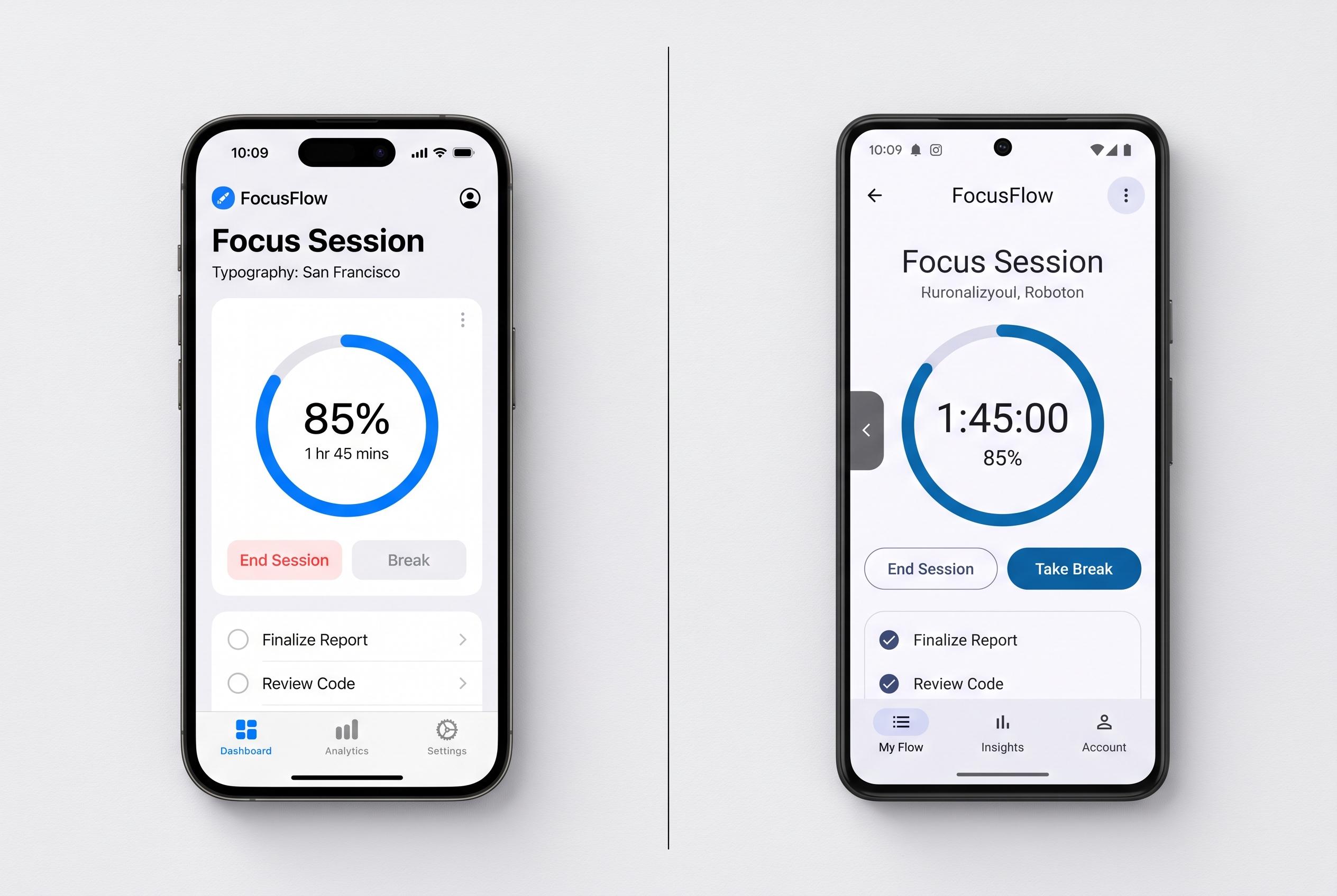

As mobile platforms evolve, understanding and respecting the distinct interaction models, visual conventions, and accessibility features of iOS and Android are critical for creating native-feeling, user-centric apps in 2026, says design expert Kirtika Srivastava.
Designing for mobile is never just a matter of fitting content onto a small screen. On iOS and Android, the underlying interaction model matters as much as the visual layer. Kirtika Srivastava argues in TheUXMentor that the most common mistake among newer designers is treating both systems as interchangeable, when users arrive with different habits, expectations and device-level conventions already in mind.
Apple’s Human Interface Guidelines and Google’s Material Design remain the two main design languages shaping those expectations. UXPin says the difference is not cosmetic: it affects navigation, component behaviour, typography and even how users interpret basic controls. That is why products that feel instinctive on one platform can seem awkward on the other if they are copied too literally.
Navigation remains one of the clearest dividing lines. Srivastava notes that iPhone users tend to expect bottom navigation, swipe-based movement and a navigation bar that disappears into the interface, while Android users are more accustomed to Material navigation patterns and system back gestures. As UXPin and Gendesigns.ai both observe, trying to impose one platform’s structure on the other often creates friction rather than coherence.
The same applies to components. Buttons, switches, dialogs and date pickers may look similar at first glance, but their placement, motion and response patterns are intentionally different. Gendesigns.ai says many design errors come from flattening those differences in the name of consistency. In practice, that can make an app feel less native, not more polished.
Typography and spacing also need platform-specific treatment. Srivastava points to Apple’s Dynamic Type, which allows text to scale more naturally for accessibility, while Android’s Material system provides a more structured typographic framework across screen sizes. Gendesigns.ai’s typography guide makes the same point: designers should follow each platform’s recommended type scale rather than reusing one system across both. That approach improves readability and reduces the risk of a design feeling forced.
Gestures, accessibility and AI are raising the stakes further in 2026. Srivastava says users now expect smoother swipe navigation on iPhone and predictive back behaviour on Android, while both platforms have become more dependent on touch and motion for core tasks. At the same time, accessibility is no longer optional. Both operating systems offer stronger support for screen readers, scalable text, voice control and contrast settings, and designers are expected to build for those features from the outset. Several industry guides also note that AI-driven features are increasingly shaping mobile interfaces, but the best implementations still rely on transparency and user control rather than hidden automation.
The broader lesson is that brand consistency should not come at the cost of platform fit. As Asapp Studio notes, visual systems such as Liquid Glass on iOS and Material You on Android have widened the stylistic gap between the two ecosystems, making native-feeling interaction more important, not less. Srivastava’s central argument is straightforward: good mobile design respects the habits users already have. A product does not need to look identical everywhere to feel like the same brand. It needs to feel right on the device being used.
Disclaimer: This content is intended for informational purposes only. Readers are advised to exercise their own judgement, conduct due diligence, or consult a qualified expert before acting on any information provided.